Quiz Multiple Choice Module for outcome-based quiz Experiences
The Quiz Multiple Choice module for outcome-based quiz Experiences is a quiz-type module, used to ask participants a question with multiple options from which they can select multiple answers. (e.g. in a Shopify Product Quiz).
It typically contains some copy text (e.g., label, byline) and the possible answers to choose from.
Its design (layout and display style) can be configured.
You can edit the Quiz Multiple Choice module in the Page Builder by clicking it, or by clicking on the Pencil icon.
The following can be edited (available from the tabs at the top):
- Settings — Here you configure the label and possible answers to choose from.
- Design — To define the layout and design.
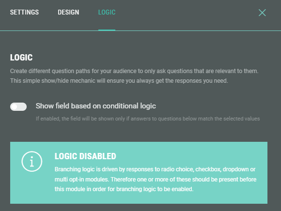
- Logic — To create different question paths for your audience.
- Advanced — To customize the error message to be shown when the question is not answered.
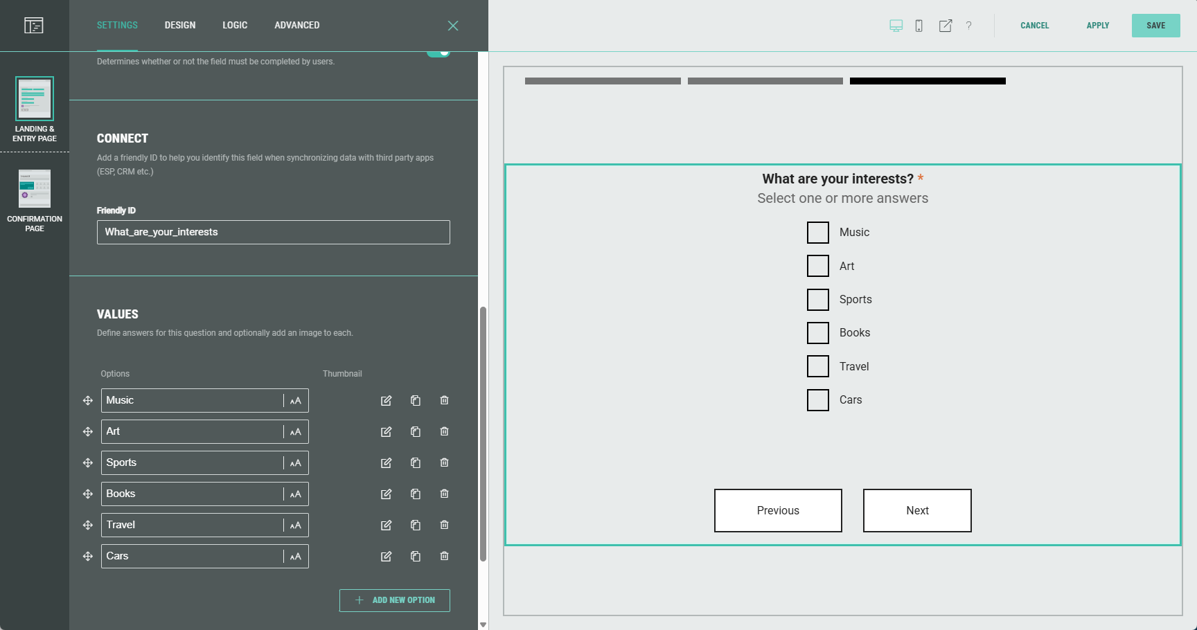
Settings
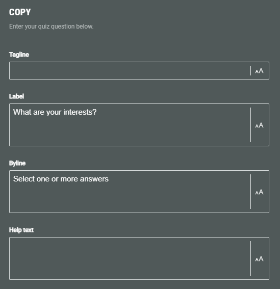
Copy
Enter a label to describe the quiz question. Optionally, you can add a tagline, byline and help text.
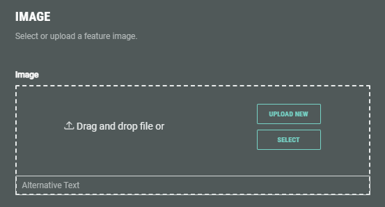
Image
If desired, you can add an image to illustrate the quiz question.
Select an existing one from your asset library (which contains your uploaded assets) , from Pexels or from images uploaded within the Experience.
Or upload a new one within the Experience.
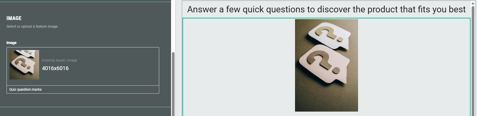
Example:
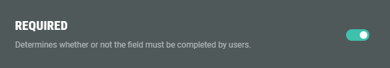
Required
Turn on the toggle to make answering the question mandatory for participants.
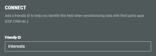
Connect
Add a Friendly ID to help you identify this field when synchronizing data with third party apps (ESP, CRM etc.)
Values
Specify the possible answers participants can choose from.
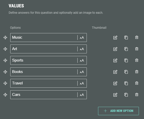
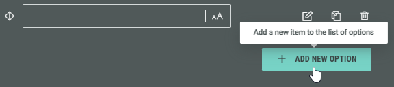
You can add new answers by clicking on the + Add New Option button.
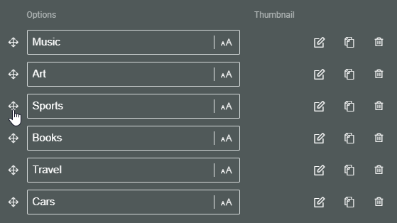
The options can be ordered the way you want by holding down the mouse cursor onto one of the 4-directional arrow icons, and dragging and dropping that option to the desired location.
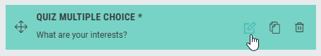
Each option shows the following clickable icons on the right:
 Edit choice — To edit the option.
 Clone choice — To duplicate the option, with identical label, data and image.
 Remove choice — To delete the option.
Edit choice
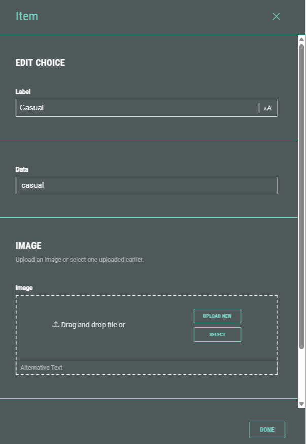
The Edit choice screen shows the following options:
- Label — The option label. This field gets auto-populated after adding an option label in the Values section on the main screen. If desired, you can change it here.
- Data — The data value is used to match the quiz answer with the field from the integrated system (such as Shopify). Note that this value is case-sensitive.
Example: We're asking a quiz question about clothing style.
Possible options are: Casual, Formal, Workout, Party.
These correspond to product tags in our Shopify store, which have the same values, but in lower case: casual, formal, workout, party.
In our Grow Experience we're using tag1 as Friendly ID for the quiz question.
We add the following option labels as answers for that question: Casual, Formal, Workout, Party.
To match each of these options to our Shopify product tag values, we add the following data values for each of these labels: casual, formal, workout, party.
For more information on how to use and define the Friendly ID in a quiz question, and how to set up matching fields for the Shopify integration, have a look here.
- Image — If desired, you can add an image that will be set as thumbnail for the option.
Thumbnail images will become visible when selecting Card or Circle as tile style, as explained below.
Select an existing one from your asset library (which contains your uploaded assets) , from Pexels or from images uploaded within the Experience. Or upload a new one within the Experience.
Example of an image selection:

Selected images will be applied as thumbnails (per option).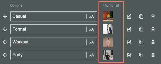
- Answer response — You can optionally add a response that participants will see when they select this option as their answer.
Example of an answer response:

When a participant selects the option, it shows the answer response below: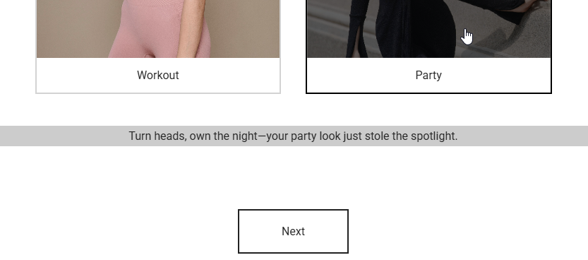
Design
Slide transition
You can activate the Allow automatic transition toggle. As soon as an answer is selected for the single choice quiz question, it will automatically transition to the next slide, rather than having the participant click Next.
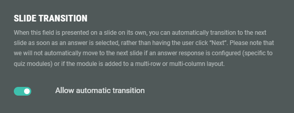
Note: The automatic transition will only work when the quiz question is presented on a slide on its own.
If an answer response is configured (specific to quiz modules) or if the module is added to a multi-row or multi-column layout, it won't automatically transition to the next slide.
Field width
Determines the width of the quiz question options when displayed.
Example:
- Extra compact: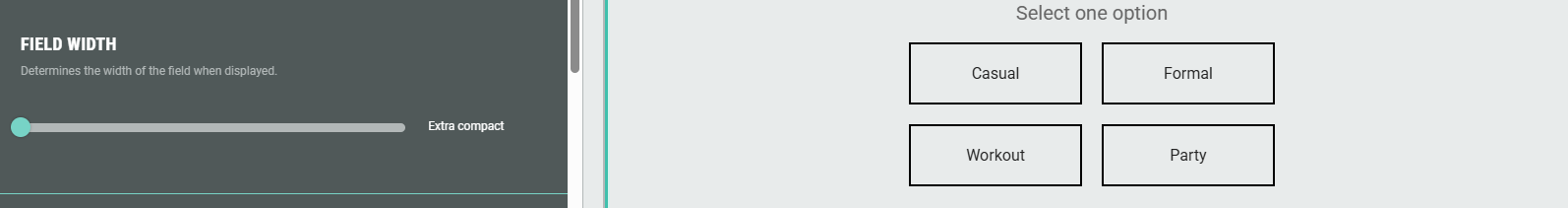
- Large: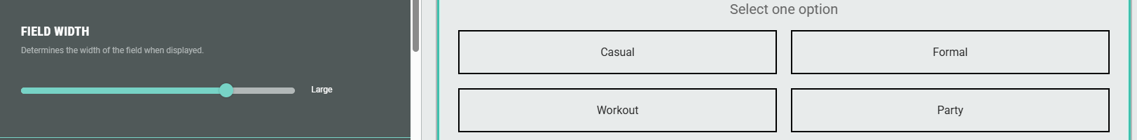
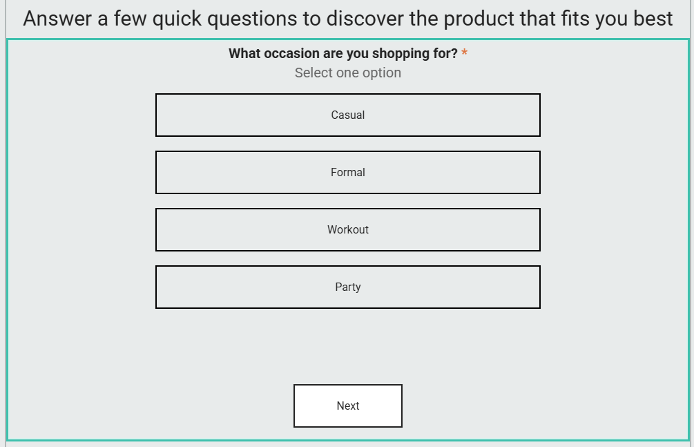
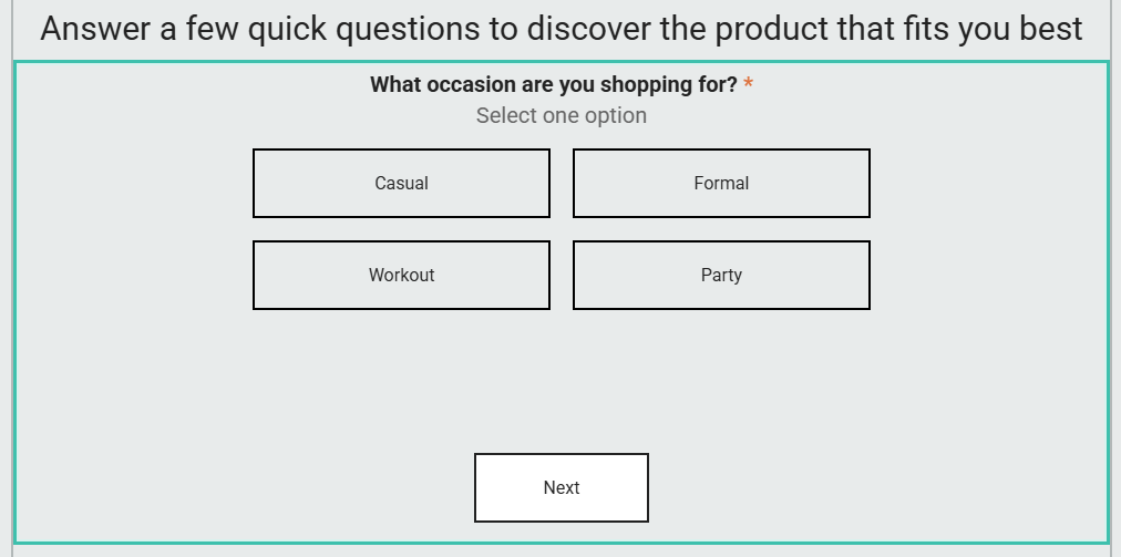
Template
Select the layout of the possible options: List or Grid. (Stack is being phased out and not advised for being used)
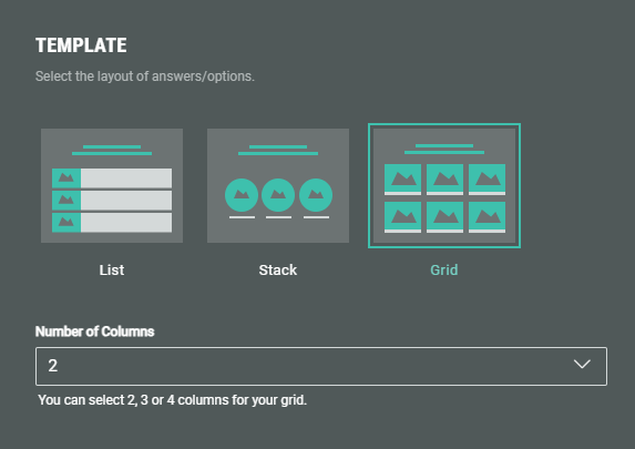
- List — The options are shown underneath each other, as a list of items.
- Grid — When Grid is selected, a drop-down is shown in which you set the number of columns for your grid (2, 3 or 4). The options are then shown in a grid, based on the selected number of columns.
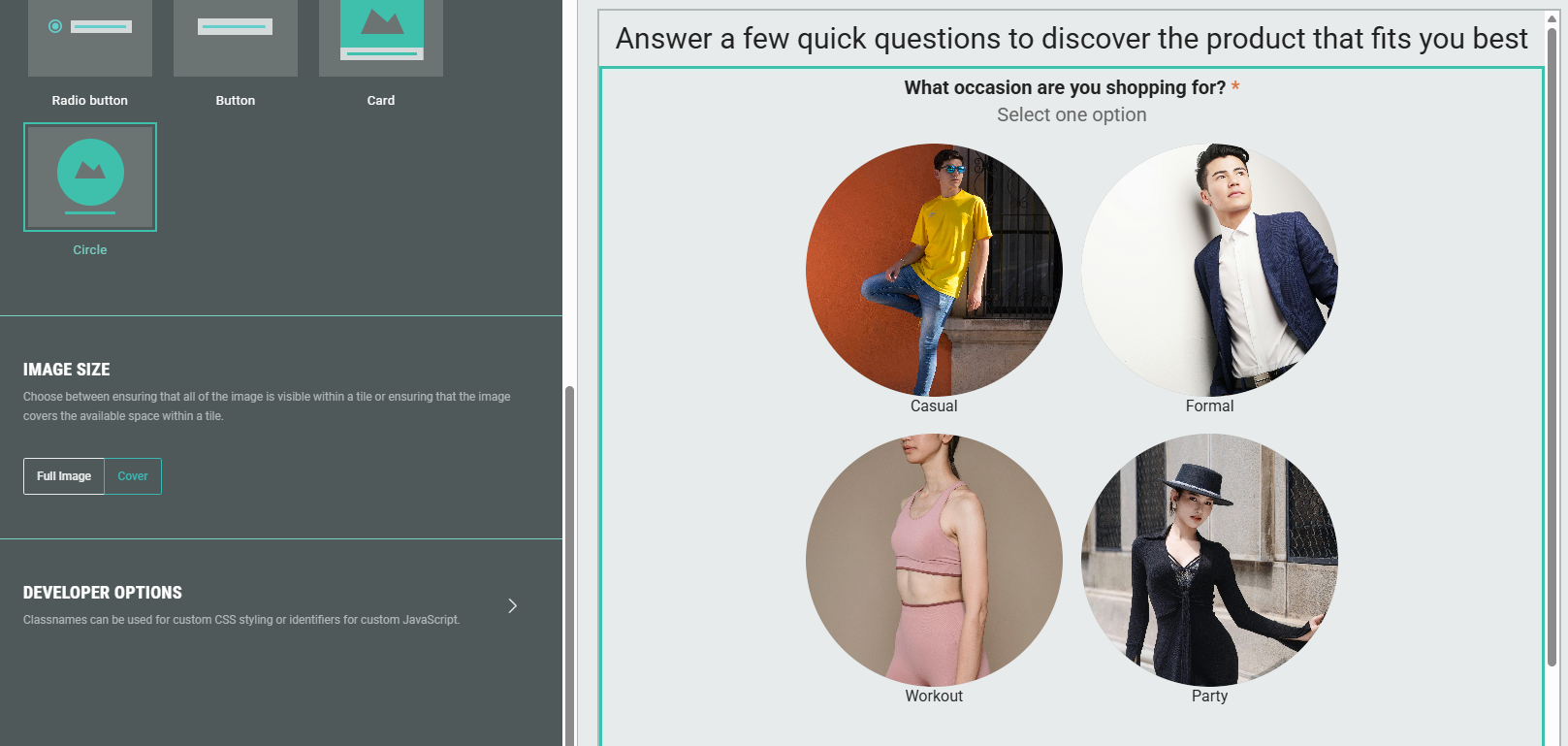
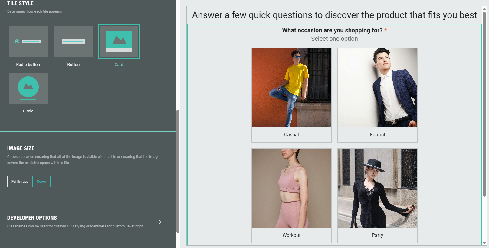
Tile style
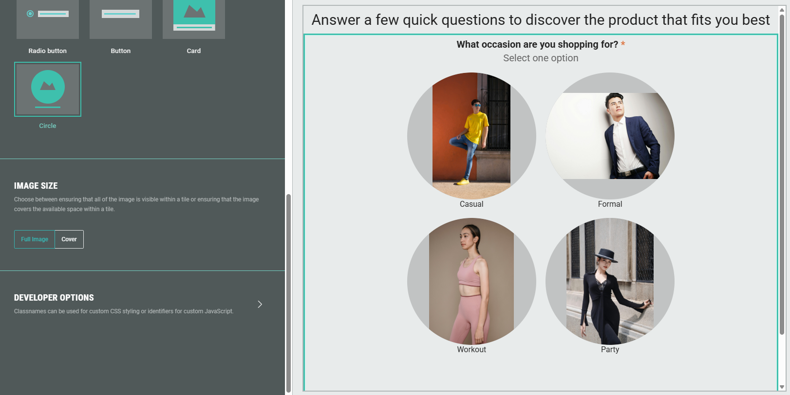
Determines the style that the options are presented to the participants: Radio button, Button, Card or Circle.
If you selected the List template previously, you will also see the Dropdown option.
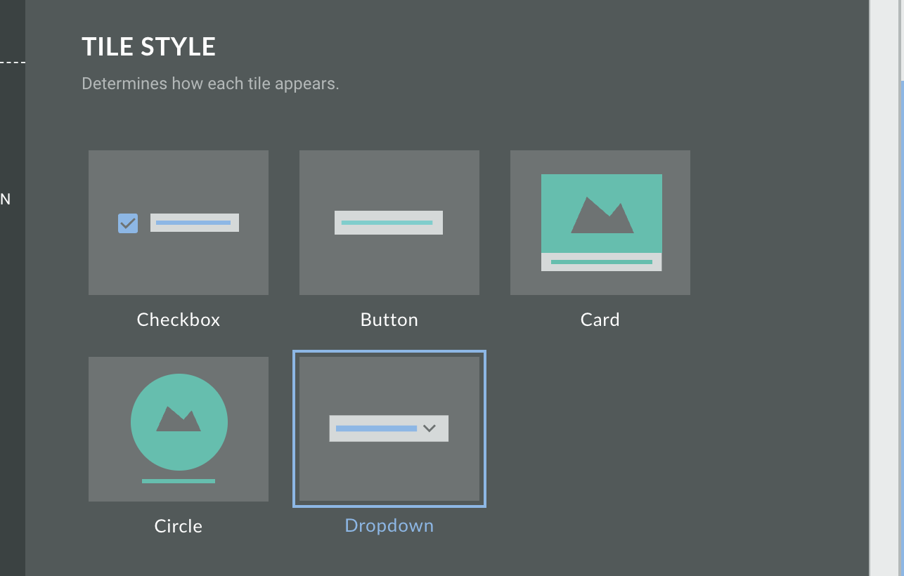
When Card or Circle is selected, thumbnail images set in the settings tab, become visible.
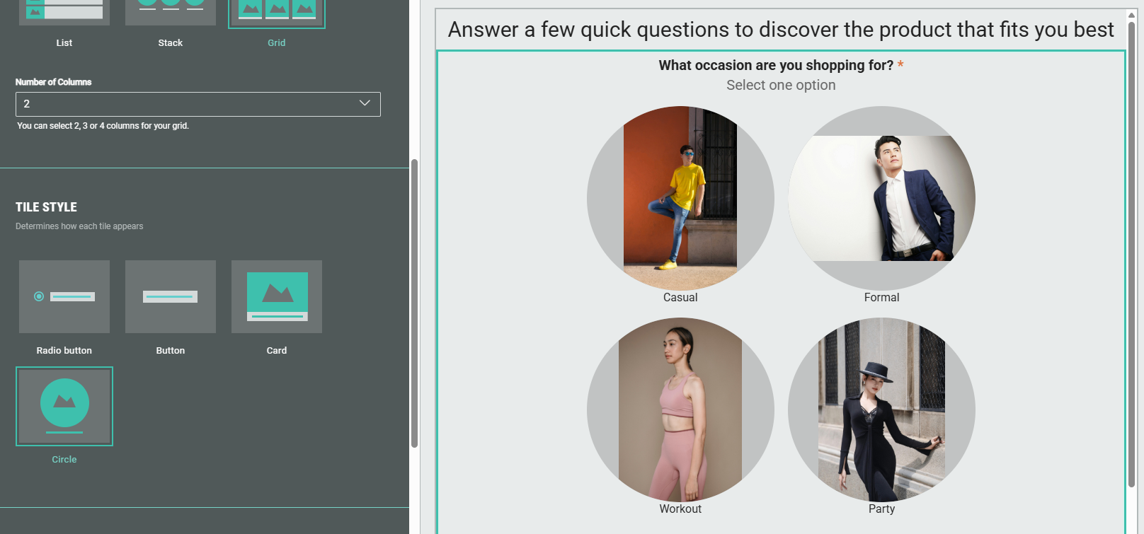
Image size
Full image
Choose Full image to ensure that for each image thumbnail, the entire image is visible within the tile.
- For Circle tile style: This can cause spacing to be added on top and below the image when the image has a landscape format, or spacing on the left and right of the image when the image has a portrait format.
- For Card tile style: This can cause heights and widths of the images to be different, depending on their layout (landscape/portrait) and size.
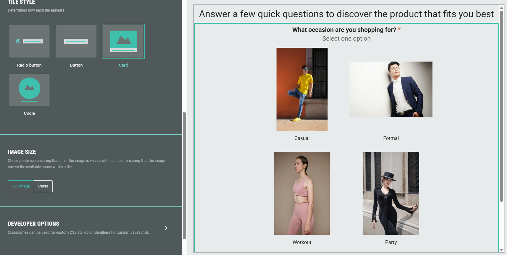
Cover
Choose Cover to ensure that for each image thumbnail, the image covers the available space within a tile.
Images are scaled, while maintaining their aspect ratio.
- Circle tile style:
- Card tile style:
Developer options
You can add a CSS class name to use custom CSS styling for the Single Choice Quiz module.
Logic
On the Logic tab, different question paths can be created for your audience.